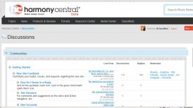
….It seems that way. I’ve been surfing the forum for a bit and I notice a lot of upset and disheartened loyal members on the message board. The biggest complaint by members is the forum is awkward and difficult to read due to the poor layout and skin design. Another complaint is there’s no more quick reply feature, no quote feature, and when you click on the thread, it takes you to the last post. Whaat? Well that’s odd, you need to read the first post before you can reply to the thread don’t ya? Now when you click the thread you have to click back to the first page just to read the opening post. More of a process and more time consuming for the end user. You gotta do extra stuff just to read the thread before you can leave a comprehensive comment.
 Some of the latest threads on H-C is “what guitar forum will be my new home?”, now that HarmonyCentral 2.0 failed them. There’s lots of great options out there. I would like to plug a really cool guitar forum called Gear-Monkey.com. Gear-Monkey uses the same software as the old Harmony-Central used back in the day. The true and tested software that is user friendly and stable. It’s built for the end user.
Gear-Monkey.com also allows you to change your skin. If you like dark themes, then the default theme is for you. If you like Harmony-Central’s light theme, then just scroll down to the bottom of the page (gear-monkey.com/forum) and on the left side you’ll see a drop down menu. You can change it to “GreenFox” which is what you see now or “Default Style” to give you that light Harmony-Central look. The choice is yours! How many guitar forums have those kind of cool features? Go check out Gear-Monkey.com. Maybe you’d like to make this place your new home.


TheGearPage.Net is an excellent site.
Indeed this new version is weird… I really wonder how much they’ve spent into it!
Harmony Central is dead, killed by hubris and arrogance more than any one technical glitch.
The Bass forum & Effects forum moved over to http://www.exilecentral.com/forum/ – I almost forgot what it was like to have a real, live forum with a real, live, community.